1. Storybook
- 효과적인 디자인 시스템 구성을 위해서는 표준화된 패턴 및 재사용 가능한 컴포넌트의 명세를 명확하게 확인할 수 있는 문서 필요
- 애플리케이션과 구분된 샌드박스 개발 공간 필요
- 프론트엔드 기술 스택 - UI 컴포넌트 테스트
Storybook- 격리된 UI 컴포넌트 개발환경을 구성할 수 있게끔 도와주는 도구
- 프로젝트 내 디자인 시스템을 효율적으로 개발하고 테스트하기 위해 사용
- cf. emotion을 활용한 크몽 프론트엔드 스타일링 시스템 (brunch.co.kr)
- cf. Storybook: Frontend workshop for UI development
- cf. @storybook/react - npm (npmjs.com)
1.1 Storybook를 사용해야하는 이유
컴포넌트 기반 개발 및 테스팅 용이성: 각 컴포넌트를 독립적으로 개발하고 테스트할 수 있기 때문에 코드의 재사용성이 향상되고 개발자는 컴포넌트의 상태 및 다양한 사용 사례를 효과적으로 관리문서화 및 디자인 시스템 구축: 컴포넌트의 사용법과 속성을 문서화하고 레퍼런스로 제공시각적 테스팅 및 디자인 시스템 검증: 시각적 테스팅을 지원하여 UI 컴포넌트의 변경 사항을 빠르게 확인하고 디자인 시스템의 일관성을 유지빠른 개발 환경 제공: 빠른 프로토타이핑 및 개발 환경을 제공컴포넌트 간의 상호작용 및 스토리 작성: 컴포넌트 간의 상호작용을 보여주기 위해 스토리를 작성하는 기능을 제공
1.2 Storybook 주요 개념
스토리 (Story): 하나 이상의 컴포넌트 상태를 보여주는 단위컴포넌트: UI를 구성하는 독립적인 요소애드온(addon): Storybook에 추가 기 능을 제공하는 확장 기능Manager Area: (좌측) 스토리 목록 및 다양한 작업을 수행할 수 있는 공간Preview Area: (우측) 스토리의 시각 적인 결과물이 표시되는 영역
2. 설치 및 설정
1npx storybook@latest init
npx storybook@next init명령어로 Next.js 프로젝트를 위한 스토리북 세팅- Next.js를 위한 여러가지 스토리북 파일들이 생성됨 (
.storybook/main.ts,.storybook/preview.ts,stories폴더 등)
- Next.js를 위한 여러가지 스토리북 파일들이 생성됨 (
storybook/main.ts파일에서 StorybookConfig에stories: [‘../app/**/*.stories.tsx']코드 추가- 혹시나
package.json에sideEffects: true로 설정되어있으면 제거
- 혹시나
tailwind.config.js파일에 tailwind 적용을 위해서‘./stories//*.{js,ts,jsx,tsx,mdx}’코드 추가- 원하는 컴포넌트의 스토리 작성 (e.g.
Button.stories.ts) - 스토리북을 다시 실행하고 싶다면
yarn storybook명령어로 실행
2.1 tailwind 추가 설정
.storybook/preview.ts
1import type { Preview } from '@storybook/react'2import '../src/styles/globals.css' // Storybook에 tailwindcss 설정을 적용34// React 컴포넌트의 미리보기5const preview: Preview = {6parameters: {7// on으로 시작하고 대문자로 시작하는 이름을 가진 속성들을 찾는다.8actions: { argTypesRegex: '^on[A-Z].*' },9controls: {10// 컨트롤의 타입에 따라 일치하는 정규식을 정의11matchers: {12// color 타입의 컨트롤은 background 또는 color로 끝나는 속성 이름을 가질 수 있다.13color: /(background|color)$/i,14// date 타입의 컨트롤은 Date로 끝나는 속성 이름을 가질 수 있다.15date: /Date$/i,16},17},18},19}2021export default preview
2.2 storybook에 폰트 적용 예시
preview-head.html
1<!-- 스토리북에 Google Material Symbols 적용 -->2<!-- @see https://developers.google.com/fonts/docs/material_symbols?hl=ko#use_in_web -->3<link href="https://fonts.googleapis.com/css2?family=Material+Symbols+Outlined" rel="stylesheet" />45<!-- google font 적용 -->6<link href="https://fonts.googleapis.com/css2?family=Black+Han+Sans&display=swap" rel="stylesheet" />78<link9href="https://fonts.googleapis.com/css2?family=Noto+Sans+KR:wght@100;200;300;400;500;600;700;800;900&display=swap"10rel="stylesheet"11/>
2.3 Storybook 배포
Chromatic: Storybook에 통합되어 시각적 테스팅과 디자인 시스템 관리를 위한 온라인 플랫폼
- Chromatic 설치:
yarn add —dev chromatic - Chromatic 계정 생성 및 프로젝트 추가 (https://www.chromatic.com/)
- Chromatic 사이트에서 프로젝트 생성 후, Publish 명령어 입력
npx chromatic —project-token=TOKEN_RANDOM
- 스토리북 publishing이 완료되면, 터미널에 배포된 chromatic url에 들어가서 스토리 확인
3. 버튼 컴포넌트 스토리 예시
3.1 index.tsx
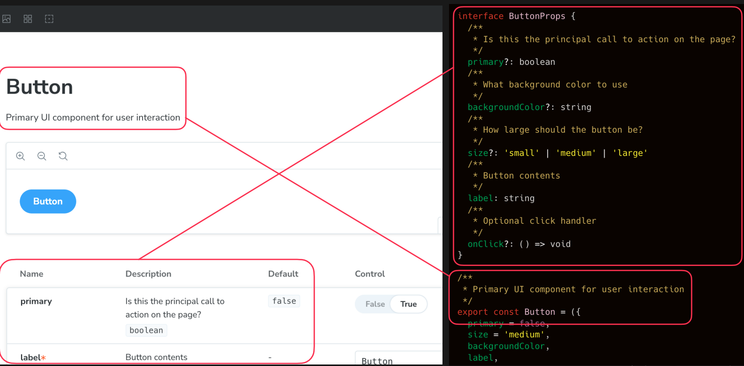
위 그림과 같이 주석 자체가 그대로 문서화된다. 이게 가능한 이유는 stories.ts에 tags: ['autodocs']를 추가해줬기 때문.
1import classNames from 'classnames'23import Spinner from '../Spinner'45/**6* React.ComponentPropsWithoutRef<'button'>은 button 요소의 ref을 제외한 모든 속성을 상속받는다.7*/8interface Props extends React.ComponentPropsWithoutRef<'button'> {9/**10* 버튼 크기를 지정합니다 (기본값: 'md')11*/12size?: 'xs' | 'sm' | 'md'13/**14* 버튼 색상을 지정합니다 (기본값: 'black')15*/16color?: 'black' | 'grey' | 'orange' | 'red'17/**18* 버튼 내부 색상이 칠해져 있는지 여부를 지정합니다19*/20outline?: boolean21/**22* 사용자 인터렉션이 진행되고 있는지 여부를 지정합니다23*/24isLoading?: boolean25/**26* 버튼이 width: 100%여야 하는 경우 사용합니다27*/28fullWidth?: boolean29}3031/**32* 버튼을 표시하기 위한 컴포넌트33*/34export default function Button({35color = 'black',36size = 'md',37outline,38fullWidth,39isLoading,40children,41...props // 나머지 모든 속성을 props로 전달42}: Props) {43return (44<button45{...props}46disabled={isLoading || props.disabled} // 로딩 중이면, disabled 속성을 추가47className={classNames(48props.className, // 다른 클래스 이름이 있다면 그것도 포함49'disabled:opacity-50 relative', // disabled 속성이 있을 때, 투명도를 50%로 변경50size === 'xs' && 'text-xs px-2',51size === 'sm' && 'text-sm px-3 py-1',52size === 'md' && 'text-base px-5 py-2',53fullWidth && 'w-full',54outline === true55? {56'text-black': true,57border: true,58'border-black': color === 'black',59'border-slate-300': color === 'grey',60'border-orange-500': color === 'orange',61'border-red-700': color === 'red',62}63: {64'text-white': true,65'bg-black': color === 'black',66'bg-slate-300': color === 'grey',67'bg-orange-500': color === 'orange',68'bg-red-500': color === 'red',69},70)}71>72{isLoading ? (73<>74{/* absolute : 요소를 절대위치로 띄움 */}75<div className="absolute top-0 left-0 h-full w-full flex justify-center items-center">76<Spinner size={size} />77</div>78{/* opacity-0 : 요소를 화면에만 숨겨서, 너비를 그대로 함 */}79<div className="opacity-0">{children}</div>80</>81) : (82children83)}84</button>85)86}
3.2 index.stories.ts
1import type { Meta, StoryObj } from '@storybook/react'23import Button from '.'45const meta = {6title: 'Button',7component: Button,8tags: ['autodocs'], // "autodocs" tags를 추가하면, 컴포넌트 문서 작성 가능9args: {10children: 'Hello World!', // 컴포넌트의 기본 텍스트11},12} satisfies Meta<typeof Button>1314/**15* StoryObj 타입 : Storybook의 스토리 객체를 나타냄16*/17export default meta18type Story = StoryObj<typeof meta>1920export const DefaultButton: Story = {21args: {},22}
4. input 컴포넌트 스토리 예시
4.1 index.tsx
1import classNames from 'classnames'2import { ForwardedRef, forwardRef } from 'react'34interface Props extends React.ComponentPropsWithoutRef<'input'> {}56/**7* Input 요소를 처리하기 위한 컴포넌트8* @description forwardRef : ref를 전달하기 위한 함수9* @see https://ko.react.dev/reference/react/forwardRef10*/11const Input = forwardRef(function Input(12{ ...props }: Props, // 나머지 모든 속성을 props로 전달13ref: ForwardedRef<HTMLInputElement>,14) {15return (16<input17{...props}18ref={ref} // ref를 전달19className={classNames(props.className, 'border text-base p-2 outline-none text-black disabled:opacity-50')}20/>21)22})2324export default Input
4.2 index.stories.ts
1import type { Meta, StoryObj } from '@storybook/react'23import Input from '.'45const meta = {6title: 'Input',7component: Input,8tags: ['autodocs'], // "autodocs" tags를 추가하면, 컴포넌트 문서 작성 가능9args: {10value: 'Hello World!', // 컴포넌트의 기본 텍스트11disabled: false,12},13} satisfies Meta<typeof Input>1415/**16* StoryObj 타입 : Storybook의 스토리 객체를 나타냄17*/18export default meta19type Story = StoryObj<typeof meta>2021export const DefaultInput: Story = {22args: {},23}
5. text 컴포넌트 스토리 예시
5.1 index.tsx
1import classNames from 'classnames'23/***4* React.ComponentPropsWithoutRef<'span'>은 span 요소의 ref을 제외한 모든 속성을 상속받는다.5*/6interface Props extends React.ComponentPropsWithoutRef<'span'> {7/**8* 텍스트의 크기를 설정합니다. (기본값: md)9*/10size?: '4xl' | '3xl' | '2xl' | 'xl' | 'lg' | 'md' | 'sm' | 'xs'11/**12* 텍스트의 색상을 설정합니다. (기본값: black)13*/14color?: 'black' | 'grey' | 'red' | 'white'15/**16* 텍스트의 굵기를 설정합니다. (기본값: normal)17*/18weight?: 'light' | 'normal' | 'bold'19}2021/**22* 일반적인 텍스트를 표시하기 위한 컴포넌트23*/24export default function Text({25size = 'md',26color = 'black',27weight = 'normal',28...props // 나머지 모든 속성을 props로 전달29}: Props) {30return (31<span32{...props}33className={classNames(34props.className, // 다른 클래스 이름이 있다면 그것도 포함35{36'text-4xl': size === '4xl',37'text-3xl': size === '3xl',38'text-2xl': size === '2xl',39'text-xl': size === 'xl',40'text-lg': size === 'lg',41'text-base': size === 'md',42'text-sm': size === 'sm',43'text-xs': size === 'xs',44},45{46'text-black': color === 'black',47'text-zinc-400': color === 'grey',48'text-red-500': color === 'red',49'text-white': color === 'white',50},51{52'font-light': weight === 'light',53'font-normal': weight === 'normal',54'font-bold': weight === 'bold',55},56)}57/>58)59}
5.2 index.stories.ts
1import type { Meta, StoryObj } from '@storybook/react'23import Text from '.'45const meta = {6title: 'Text',7component: Text,8tags: ['autodocs'],9args: {10children: 'Hello World!', // 컴포넌트의 기본 텍스트11},12} satisfies Meta<typeof Text>1314/**15* StoryObj 타입 : Storybook의 스토리 객체를 나타냄16*/17export default meta18type Story = StoryObj<typeof meta>1920export const DefaultText: Story = {21args: {},22}2324export const SizedText: Story = {25args: { size: '4xl' },26}2728export const ColoredText: Story = {29args: { color: 'red' },30}3132export const WeightedText: Story = {33args: { weight: 'bold' },34}
6. Spiner 컴포넌트 스토리 예시
6.1 index.tsx
1interface Props {2/**3* 스피너의 크기를 지정합니다 (기본값: 'md')4*/5size?: 'xs' | 'sm' | 'md'6}78/**9* 스피너를 표시하기 위한 컴포넌트10* @see https://tailwindcss.com/docs/animation#spin11*/12export default function Spinner({ size = 'md' }: Props) {13return (14<span15className="material-symbols-outlined animate-spin"16style={{17fontSize: size === 'md' ? '1rem' : size === 'sm' ? '0.875rem' : '0.75rem',18}}19>20progress_activity21</span>22)23}
6.2 index.stories.ts
1import type { Meta, StoryObj } from '@storybook/react'23import Spinner from '.'45const meta = {6title: 'Spinner',7component: Spinner,8tags: ['autodocs'],9} satisfies Meta<typeof Spinner>1011/**12* StoryObj 타입 : Storybook의 스토리 객체를 나타냄13*/14export default meta15type Story = StoryObj<typeof meta>1617export const DefaultSpinner: Story = {18args: {},19}
7. Product 컴포넌트 스토리 예시
7.1 index.tsx
1import dayjs from 'dayjs'2import relativeTime from 'dayjs/plugin/relativeTime'3import 'dayjs/locale/ko'45import Text from '../Text'67interface Props {8/** 상품 이름 */9title: string10/** 상품 가격 */11price: number12/** 상품 등록 시간 */13createdAt: string14/** 상품 대표 이미지 주소 */15imageUrl: string16/** 상품 판매 여부 */17isSoldOut?: boolean18}1920/***21* @see https://day.js.org/docs/en/plugin/relative-time#docsNav22*/23dayjs.extend(relativeTime).locale('ko')2425/**26* 상품 미리보기 컴포넌트27* @returns28*/29export default function Product({ title, price, createdAt, imageUrl, isSoldOut }: Props) {30return (31<div className="flex flex-col border border-slate-300 relative">32{/* 판매 완료 시 투명도 및 판매 완료 문구 표시 */}33{isSoldOut && (34<div className="absolute top-0 left-0 w-full h-full bg-slate-900 opacity-70 flex justify-center items-center">35<Text color="white">판매 완료</Text>36</div>37)}38{/* 이미지 */}39<div className="h-36 bg-cover bg-center" style={{ backgroundImage: `url(${imageUrl})` }} />40{/* 설명 */}41<div className="h-20 flex flex-col px-3 justify-center">42{/* 제품명 */}43{/* 텍스트가 너무 길어서 한 줄로 표시되지 않을 때, 넘치는 부분을 ...으로 표시 */}44<Text className="text-ellipsis overflow-hidden whitespace-nowrap block">{title}</Text>45<div className="flex justify-between items-center flex-wrap">46{/* 가격 */}47{/* @see https://developer.mozilla.org/en-US/docs/Web/JavaScript/Reference/Global_Objects/Number/toLocaleString#using_tolocalestring */}48<div>49<Text weight="bold"> {price.toLocaleString()} </Text>50<Text weight="bold" size="sm">51원52</Text>53</div>54{/* 날짜 */}55{/* @see https://day.js.org/docs/en/display/from-now#docsNav */}56<Text weight="light" color="grey" size="sm">57{dayjs(createdAt).fromNow()}58</Text>59</div>60</div>61</div>62)63}
7.2 index.stories.ts
1import { faker } from '@faker-js/faker'2import type { Meta, StoryObj } from '@storybook/react'34import Product from '.'56const meta = {7title: 'Product',8component: Product,9tags: ['autodocs'], // "autodocs" tags를 추가하면, 컴포넌트 문서 작성 가능10args: {},11// decorators : 추가적인 값을 부여할 수 있는 옵션12decorators: [13// Story 하나 하나를 그릴 떄, 데코레이터로 감싸져서 그려짐14// 여기서는 가로 사이즈를 52로 고정하는 데코레이터를 추가15Story => (16<div className="w-52">17<Story />18</div>19),20],21} satisfies Meta<typeof Product>2223/**24* StoryObj 타입 : Storybook의 스토리 객체를 나타냄25*/26export default meta27type Story = StoryObj<typeof meta>2829export const DefaultProduct: Story = {30args: {31title: '샘플 제품',32price: 50_000,33createdAt: '2021-01-01',34imageUrl: faker.image.dataUri(), // Faker 랜덤 이미지 주소 생성35},36}3738export const SoldOutProduct: Story = {39args: {40title: '샘플 제품',41price: 50_000,42createdAt: '2021-01-01',43imageUrl: faker.image.dataUri(), // Faker 랜덤 이미지 주소 생성44isSoldOut: true,45},46}
8. ShopProfileImage 컴포넌트 스토리 예시
8.1 index.tsx
1import classNames from 'classnames'23interface Props {4/** 상점 프로필 이미지 주소 */5imageUrl?: string6/** 추가 ClassName 부여가 필요한 경우 사용할 Props */7className?: string8}910/**11* 상점 프로필 이미지 컴포넌트.12* ImageUrl Props를 넘기지 않으면 기본 상점 아이콘을 화면에 보여준다.13* */14export default function ShopProfileImage({ imageUrl, className }: Props) {15// 이미지가 없는 경우16if (!imageUrl) {17return (18<div className={classNames(className, 'rounded-full bg-slate-200 w-14 h-14 flex justify-center items-center')}>19<span className="material-symbols-outlined text-slate-500">storefront</span>20</div>21)22}2324// 이미지가 있는 경우25return (26<div27className={classNames(className, 'rounded-full w-14 h-14 bg-cover bg-center')}28style={{ backgroundImage: `url(${imageUrl})` }}29/>30)31}
8.2 index.stories.ts
1import { faker } from '@faker-js/faker'2import type { Meta, StoryObj } from '@storybook/react'34import ShopProfileImage from '.'56const meta = {7title: 'ShopProfileImage',8component: ShopProfileImage,9tags: ['autodocs'], // "autodocs" tags를 추가하면, 컴포넌트 문서 작성 가능10args: {},11} satisfies Meta<typeof ShopProfileImage>1213/**14* StoryObj 타입 : Storybook의 스토리 객체를 나타냄15*/16export default meta17type Story = StoryObj<typeof meta>1819export const DefaultShopProfileImage: Story = {20args: {},21}2223export const ImagedShopProfileImage: Story = {24args: {25imageUrl: faker.image.dataUri(), // Faker 랜덤 이미지 주소 생성26},27}
9. Shop 컴포넌트 스토리 예시
9.1 index.tsx
1import classNames from 'classnames'23import ShopProfileImage from '../ShopProfileImage'4import Text from '../Text'56interface Props {7/** 상점 이름 */8name: string9/** 상점 프로필 이미지 주소 */10profileImageUrl?: string11/** 상점에 등록된 상품 수 */12productCount: number13/** 상점을 팔로우 하는 팔로워 수 */14followerCount: number15/** 상점 컴포넌트 뷰 타입 */16type?: 'row' | 'column'17/** 상점 타이틀 영역 클릭시 동작할 콜백 함수 */18handleClickTitle?: () => void19/** 상점 프로필 이미지 영역 클릭시 동작할 콜백 함수 */20handleClickProfileImage?: () => void21/** ProductCount 영역 클릭시 동작할 콜백 함수 */22handleClickProductCount?: () => void23/** FollowerCount 영역 클릭시 동작할 콜백 함수 */24handleClickFollowerCount?: () => void25}2627export default function Shop({28name,29profileImageUrl,30productCount,31followerCount,32handleClickTitle,33handleClickProfileImage,34handleClickProductCount,35handleClickFollowerCount,36type = 'row',37}: Props) {38return (39<div40className={classNames(41'flex',42// row, column에 따라 다른 flex 스타일 적용43{44'flex-row': type === 'row',45'flex-col': type === 'column',46},47type === 'column' && 'gap-1 items-center',48)}49>50{/* 상점 이미지 영역 */}51<div52className={classNames('w-14', handleClickProfileImage && 'cursor-pointer')}53onClick={handleClickProfileImage}54>55<ShopProfileImage imageUrl={profileImageUrl} />56</div>57{/* 상정 설명 영역 */}58<div59className={classNames(60'flex flex-col overflow-hidden', // overflow-hidden : 요소 밖으로 삐져나오는 컨텐츠를 숨김61type === 'row' && 'ml-3 justify-around',62type === 'column' && 'w-full', // column 타입일 때 가로폭 100%63)}64>65{/* 상점 설명 - 제목 */}66<div67className={classNames(68'truncate', // 글자가 너무 길면 ...으로 표시69type === 'column' && 'text-center',70handleClickTitle && 'cursor-pointer',71)}72onClick={handleClickTitle}73>74<Text>{name}</Text>75</div>76{/* 상점 설명 - 상품 수, 팔로워 수 */}77<Text78size="sm"79color={type === 'row' ? 'grey' : 'black'}80className={classNames('flex gap-2', type === 'column' && 'justify-center')}81>82{/* 상품 수 */}83<div84className={classNames('text-center', handleClickProductCount && 'cursor-pointer')}85onClick={handleClickProductCount}86>87상품 {productCount.toLocaleString()}88</div>89|{/* 팔로워 수 */}90<div91className={classNames('text-center', handleClickFollowerCount && 'cursor-pointer')}92onClick={handleClickFollowerCount}93>94팔로워 {followerCount.toLocaleString()}95</div>96</Text>97</div>98</div>99)100}
9.2 index.stories.ts
1import { faker } from '@faker-js/faker'2import type { Meta, StoryObj } from '@storybook/react'34import Shop from '.'56const meta = {7title: 'Shop',8component: Shop,9tags: ['autodocs'],10args: {},11// decorators : 추가적인 값을 부여할 수 있는 옵션12decorators: [13// Story 하나 하나를 그릴 떄, 데코레이터로 감싸져서 그려짐14Story => (15<div className="border p-2" style={{ width: 300 }}>16<Story />17</div>18),19],20} satisfies Meta<typeof Shop>2122/**23* StoryObj 타입 : Storybook의 스토리 객체를 나타냄24*/25export default meta26type Story = StoryObj<typeof meta>2728export const DefaultShop: Story = {29args: {30name: '상점',31productCount: 999,32followerCount: 999,33type: 'row',34},35}3637export const ImagedShop: Story = {38args: {39name: '상점',40productCount: 999,41followerCount: 999,42type: 'row',43profileImageUrl: faker.image.dataUri(), // Faker 랜덤 이미지 주소 생성44},45}
10. Pagination 컴포넌트 스토리 예시
10.1 index.tsx
1type Props = {2/** 현재 사용자가 보고 있는 페이지 */3currentPage: number4/** 전체 항목의 갯수 (단, 한 페이지는 10개의 항목을 가지고 있어야 한다) */5count: number6/** 사용자가 페이지를 변경하였을때 호출할 콜백 함수 */7handlePageChange: (pageNumber: number) => void8}910const btnClassName =11'border border-slate-300 px-2 py-2 flex justify-center items-center leading-none disabled:opacity-30 hover:bg-slate-200'1213/**14* 페이지네이션을 표시하기 위한 컴포넌트15*/16export default function Pagination({ currentPage, count, handlePageChange }: Props) {17const totalPage = Math.ceil(count / 10) // 한 페이지에 10개의 항목이 있다고 가정, 올림 처리1819// max함수를 이용해 1보다 작은 값이 나오지 않도록 처리20const startPageIndex = Math.max(211, // 1부터 시작하도록22// 5개의 페이지의 시작페이지가 1이 되고, 현재 페이지가 중앙에 위치하도록 3인 경우 1이 나오도록23Math.min(totalPage - 4, currentPage - 2),24)25// 마지막 페이지가 1인 경우 4를 더하고, 전체 페이지 중 최소값26const endPageIndex = Math.min(startPageIndex + 4, totalPage)2728if (totalPage < 2) return null2930return (31<div className="flex gap-1 my-3">32{/* 이전 버튼 */}33<button className={btnClassName} disabled={currentPage === 1} onClick={() => handlePageChange(currentPage - 1)}>34이전35</button>36{/* 페이지 버튼 */}37{Array.from({ length: endPageIndex - startPageIndex + 1 }).map((_, idx) => {38const pageIndex = startPageIndex + idx39return (40<button41className={btnClassName}42key={pageIndex}43disabled={pageIndex === currentPage}44onClick={() => handlePageChange(pageIndex)}45>46{pageIndex}47</button>48)49})}50{/* 다음 버튼 */}51<button52className={btnClassName}53disabled={currentPage === totalPage}54onClick={() => handlePageChange(currentPage + 1)}55>56다음57</button>58</div>59)60}
10.2 index.stories.ts
1import type { Meta, StoryObj } from '@storybook/react'23import Pagination from '.'45const meta = {6title: 'Pagination',7component: Pagination,8tags: ['autodocs'],9args: {},10} satisfies Meta<typeof Pagination>1112export default meta13type Story = StoryObj<typeof meta>1415export const DefaultProduct: Story = {16args: {17currentPage: 1,18count: 100,19},20}