1. transition-duration
트랜지션(Transition, 전환)이란 하나의 HTML 요소에 적용된 스타일 속성 값이 다른 값으로 변경되는 것을 말합니다. 트랜지션을 제어하기 위해 트랜지션 관련 속성들을 배워야 합니다.
transition-duration은 트랜지션 효과를 몇 초에 걸쳐서 진행할지에 대한 시간을 지정할 떄 사용하는 속성입니다. 속성값으로 사용하는 시간 값을 적어주면 됩니다.
ms: millisecond (e.g. 1ms)s: second (e.g. 2s)
1<!doctype html>2<html lang="ko">3<head>4<meta charset="UTF-8" />5<meta http-equiv="X-UA-Compatible" content="IE=edge" />6<meta name="viewport" content="width=device-width, initial-scale=1.0" />7<title>트랜지션(Transition)</title>8<style>9.box {10border: 2px solid black;11padding: 10px;12}13.bar {14/* Transition이 발생하는 주체에 작성 */15width: 20px;16height: 30px;17background-color: red;18/* 500ms - 0.5초에 걸쳐서 적용 */19transition-duration: 2s;20}21/* 마우스를 올렸을 떄 */22.bar:hover {23width: 100%;24background-color: green;25}26</style>27</head>28<body>29<div class="box">30<div class="bar"></div>31</div>32</body>33</html>
2. transition-property
transition-property는 트랜지션 효과의 대상이 되는 CSS 속성을 명시할 떄 사용하는 속성입니다.
1<!doctype html>2<html lang="ko">3<head>4<meta charset="UTF-8" />5<meta http-equiv="X-UA-Compatible" content="IE=edge" />6<meta name="viewport" content="width=device-width, initial-scale=1.0" />7<title>트랜지션(Transition)</title>8<style>9.box {10border: 2px solid black;11padding: 10px;12}13.bar {14/* Transition이 발생하는 주체에 작성 */15width: 20px;16height: 30px;17background-color: red;18/* 500ms - 0.5초에 걸쳐서 적용 */19transition-duration: 2s;20/* 배경색은 즉시 바뀌지만, 넓이는 2초에 걸쳐 변경됨 */21/* 여러 값을 적용하고 싶으면 '속성, 속성'으로 작성 */22/* transition-property의 기본값은 all임 */23transition-property: width; /* width 속성만 transition 효과 적용 */24}25/* 마우스를 올렸을 떄 */26.bar:hover {27width: 100%;28background-color: green;29}30</style>31</head>32<body>33<div class="box">34<div class="bar"></div>35</div>36</body>37</html>
3. transition-timing-function
transition-timing-function을 사용하면 트랜지션 효과의 속도를 지정할 수 있습니다. 속성값은 다음과 같습니다.
ease: 처음에는 속도가 점점 빨라지다가 중간부터 점점 느려집니다. (기본값)linear: 처음에는 속도가 점점 빨라지다가 중간부터 점점 느려집니다.ease-in: 처음에는 속도가 느리지만 완료될 때까지 점점 빨라집니다.ease-out: 처음에는 속도가 빠르지만 완료될 때까지 점점 느려집니다.ease-in-out: 처음에는 속도가 느리지만 점점 빨라지다가 다시 점점 느려집니다.cubic-bezier(): 사용자 정의 속도- https://cubic-bezier.com/#.17,.67,.83,.67
- 암기해서 사용하는 것은 비효율적이기에 위 사이트를 이용해 사용하는 것이 좋음
- 여기서 곡선을 조정하면 cubic-bezier() 값을 확인할 수 있습니다.
1<!doctype html>2<html lang="ko">3<head>4<meta charset="UTF-8" />5<meta http-equiv="X-UA-Compatible" content="IE=edge" />6<meta name="viewport" content="width=device-width, initial-scale=1.0" />7<title>트랜지션(Transition)</title>8<style>9.box {10border: 2px solid black;11padding: 10px;12}13.bar {14width: 20px;15height: 30px;16background-color: red;17transition-duration: 2s;18transition-property: all;19transition-timing-function: cubic-bezier(0, 1, 0.94, -0.02);20}21.bar:hover {22width: 100%;23background-color: green;24}25</style>26</head>27<body>28<div class="box">29<div class="bar"></div>30</div>31</body>32</html>
3.1 개발자 도구에서 속도 조절하기
크롬의 개발자 도구에서 transition-timing-function 속성이 적용된 요소를 선택하면 그림과 같이 나옵니다. 그림에서 보라색 아이콘을 클릭하면, 사용자가 직접 곡선을 조정할 수 있는 화면이 나옵니다.
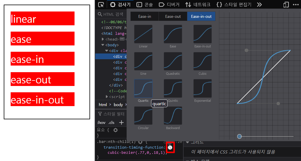
여기서 전환 효과가 완료될 때까지의 속도를 정할 수 있습니다. 곡선의 두 점을 움직일 때마다 화면 위에 결과가 미리 보입니다. 원하는 효과대로 곡선을 조정하고 나면 곡선 아래 cubic-bezier() 값이 보이는데, 이 값을 복사해 속성값으로 넣으면 됩니다.
4. transition-delay
transition-delay속성은 트랜지션 효과가 발생하기 까지의 딜레이 시간을 지정할 수 있습니다. 속성값은 시간값을 사용하여 지정합니다.
1<!doctype html>2<html lang="ko">3<head>4<meta charset="UTF-8" />5<meta http-equiv="X-UA-Compatible" content="IE=edge" />6<meta name="viewport" content="width=device-width, initial-scale=1.0" />7<title>트랜지션(Transition)</title>8<style>9.box {10border: 2px solid black;11padding: 10px;12}13.bar {14width: 20px;15height: 30px;16background-color: red;17transition-duration: 2s;18transition-property: all;19transition-timing-function: cubic-bezier(0, 1, 0.94, -0.02);20transition-delay: 2s; /* 2초에 지연시간을 가진 후에 트랜지션 효과가 발생 */21}22.bar:hover {23width: 100%;24background-color: green;25}26</style>27</head>28<body>29<div class="box">30<div class="bar"></div>31</div>32</body>33</html>
5. transition 단축 속성
지금까지 배운 속성들을 한 번에 지정할 수도 있습니다.
1<!doctype html>2<html lang="ko">3<head>4<meta charset="UTF-8" />5<meta http-equiv="X-UA-Compatible" content="IE=edge" />6<meta name="viewport" content="width=device-width, initial-scale=1.0" />7<title>트랜지션(Transition)</title>8<style>9.box {10border: 2px solid black;11padding: 10px;12}13.bar {14width: 20px;15height: 30px;16background-color: red;17/* transition-duration: 2s;18transition-property: all;19transition-timing-function: cubic-bezier(0, 1, 0.94, -0.02);20transition-delay: 2s; */21transition: 2s all cubic-bezier(0, 1, 0.94, -0.02) 500ms;22}23.bar:hover {24width: 100%;25background-color: green;26}27</style>28</head>29<body>30<div class="box">31<div class="bar"></div>32</div>33</body>34</html>